Mala
Barbara Bigosińska
- c2016
- bThe Hague
- hFonts
. . .
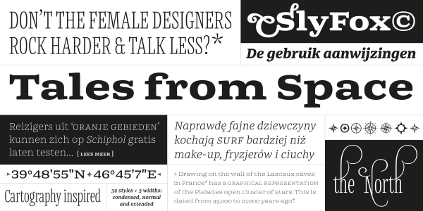
Abelard is a modern (or neoclassical) family with 10 font styles. It is a contemporary take on classic types like Baskerville, Bulmer, and Scotch Roman that has been optimised for text embedding on eReaders. The design features elements ensuring even text color, including case-sensitive forms, prominent punctuation marks, ligatures, and four sets of figures. Each font also contains ornaments resembling pen nibs, bullet points, and arrows. Abelard’s capitals are quite similar in width. The lowercase letters feature open apertures, a moderate x-height, mild stroke-contrast, and ball terminals. The lowercase ‘f’ and ‘r’ are narrow. While Abelard’s roman styles are elegant and sober, the italics are more flamboyant – just look at the lowercase ‘y’ in each italic font. Abelard’s italics are slightly narrower than the romans, and lighter in weight. The italic ‘v’, ‘w’, and ‘y’ each have their right arm curved, which improves their spacing.