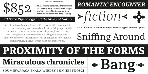
Abelard
Barbara Bigosińska
- c2016
- bThe Hague
- hFonts
. . .
Maps, of any kind, are complex and multilayered sources of information. They are not read continuously like books, but use type in a very different way. Mala by Barbara Bigosińska is designed for exactly that. With its extensive range of 32 styles in three different widths, the series enables clear labeling, distinction and structuring of information. At that, Mala doesn’t follow any particular existing style. It could be described as a quaint typeface of modern proportions and form model with a hint of “typewriter-feel”. Mala’s basic styles of normal width are geared to setting texts in a wide range of sizes and length — from headlines to body copy to labels or glosses. The Condensed and Extended styles on the other hand are designed for extreme situations where one has to work with either plenty or very little space, for instance compact titles as well as sweeping, exuberant display typography. All styles include two sets of decorative swash capitals for extra lavish layouts and many OpenType features such as small caps, an extended set of ligatures, ornaments, arrows, different sets of numerals, fractions and ordinals — all across an extended Latin character-set. The design of Mala started during the Type and Media course at the KABK in The Hague in 2013; development continued through 2016.
Styles: 32