. . .
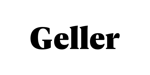
Geller Sans typeface have been developed based on his serif predecessor’s proportions. He’s quite handsome, quite organised. Looking at thin–extraheavy styles he has enough of charm to stand out in advertisement. In text styles you can relay on him. He’s able to meet demand of complex design tasks.
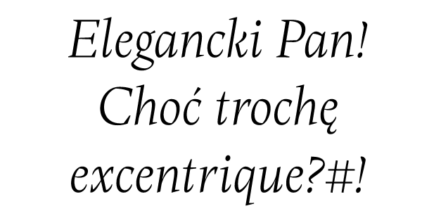
Geller Sans has been fitted with wide range of OpenType features. As Geller Serif, he has bullets & dingbats, for easier entry-point making. Entire font family comes in 4 width (Regular, Narrow, Condensed, Compressed). Each width finds its best application in different typographic fractions what makes Geller Sans easy to apply in editorial graphic design. Who’d like to challenge him?
Styles: 52