. . .
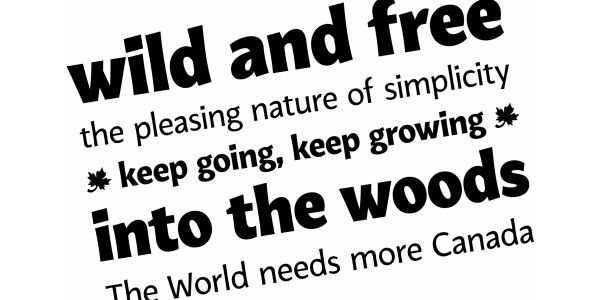
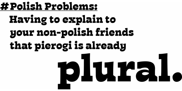
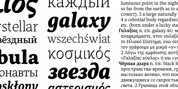
VanSans is a humanist sans family, created to bring a fun and warm spirit into the market of repetitive, simplistic designs. It was inspired by the city of Vancouver, merging the industrial feel with the friendliness and openness of its’ people. It features large x-height and open counters, making it legible and clear both in printed text and screen. The family is made to be flexible and fit to any hierarchy a user might need. With weights ranging from Thin to Extrabold, it features small caps, true italics and an extensive character set of Latin and Cyrillic. VanSans is ready to be challenged.