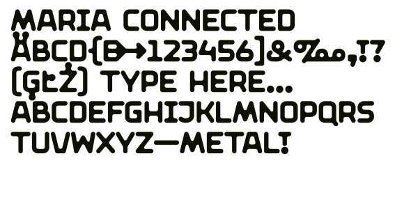
Maria Connected, Maria Unconnected
Marian Misiak
- c2016
- bWrocław
- hFonts
. . .
Two heads are better than one: the typeface takes its name from the mythical god Janus, whose two faces simultaneously look towards the East and West. The name was not chosen without reason, as the typeface was originally designed for the National Museum in Wrocław, whose collection is rich in works of both Eastern and Western art. The bi-directionality is reflected in the typeface itself: besides regular italics, it also features counter-italics. The text can be accentuated in two different ways from now. Cooperation: Dominika Nika Langosz.
Styles: 12