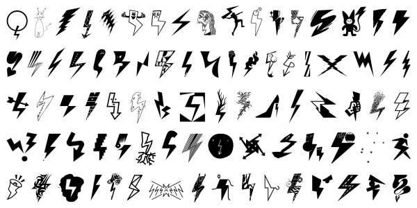
Pioruny
Marian Misiak, Honza Zamojski
- c2022
- bWrocław
- hFonts
. . .
“Di” stands for “diacritics” as the font features multiple versions of those signs based on historical forms. “Grotesk” refers to the early 19th-century sans-serif fonts the typeface draws upon. The height in the upper case letters is smaller than in the minuscules with ascenders, which provides additional room for diacritics. The diacritics signs, in turn, have variants derived from various typographic traditions - from incunabula to the substitute solutions of the shortage economy of the People’s Republic of Poland. Współpraca: Dominika Nika Langosz.
Styles: 4