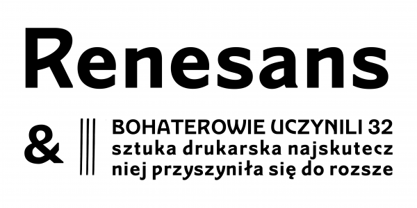
Renesans
Ania Wieluńska, Borys Kosmynka
- c2020
- bWarszawa
- hFonts
. . .
The ”New Polish Karakter” from 1594, by Jan Januszowski, Jan Kochanowski and Łukasz Górnicki was one of the first attempts to unify the way that Polish language is written in text. All texts form this book, have been set with a new, innovatory system - for the purposes of contemplating orthography, Januszowski developed two new fonts - straight one and italic.
Lazarus is a family of 4 typefaces, digitized on the basis of the ”New Karakter” fonts. Work on the project took over two years and assumed long and insightful research on the original, the development of tindividual method of digitalization and a significant extension of the original sets of characters. The entire process was described in the theoretical master's thesis under the supervision of prof. Dorota Folgi-Januszewska (pdf on the website www.lazarus.wtf), while font family was created as part of a practical diploma thesis, under the watchful eye of Michał Jarociński in a Typowa Pracownia. The diploma thesis of which Lazarus was part received a rector's distinction and was shown at the exhibition of the best graduation pieces from the Warsaw Academy of Fine Arts - Coming Out 2017.
The final set consists of two historicizing fonts, created on the basis of Januszowski's project - Italic and Upright Italic, of Regular, which is an interpretation of the antiqua used by Januszowski for Latin texts, and of Fraktur, which is an interpretation of the Mytel Polski, that was also used in the ”New Karakter”. All four typefaces have a full set of characters for Latin (WE, CE, SEE), Italic has a rich set of decorative stylistic sets, and Regular has ornaments and a set of pointing hands. Due to its historical character, the family will be perfect in classic situations, but it also stays open for experiments!
The project of Italic and Upright Italic has been financed due to the scholarship of the Minister of Culture and National Heritage.
Styles: 4