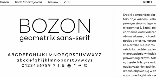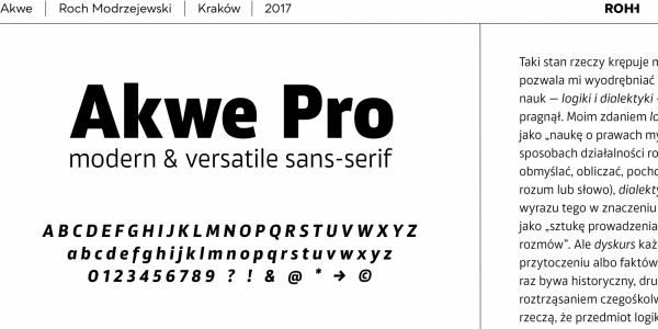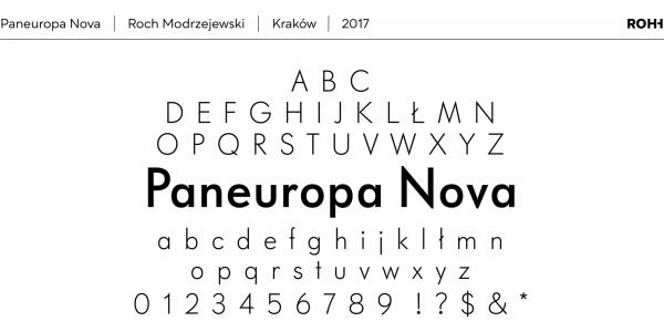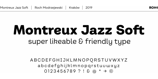
. . .
Teramo is daring, sharp and dynamic. Its personality is derived from asymmetry and movement. It is a contemporary serif family full of modern design elements playing with proportions of works of XV and XVI century masters such as Francesco Griffo or Claude Garamond.
The family features four optical sizes. Display weights are designed as modern, extraordinary variations on didone style. Teramo’s letterforms are merging classical proportions with precise, contemporary details such as asymmetric serifs, sharp edges and unconventional glyph shapes.
Teramo features a vigorous true italics strongly related to cursive handwriting. The italic styles imply movement, energy and fluency, introducing a new color to paragraph text, as well as being a powerful and interesting standalone display type.