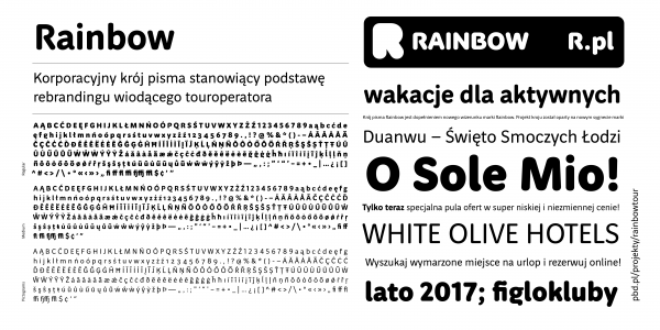
Rainbow
Maciej Majchrzak, PBD.pl
- c2015
- bWrocław
- hFonts
. . .
The Geppert Sans font family has been designed for the Eugeniusz Geppert Academy of Art and Design for promotional materials and the internal publications of the academy. The academy releases a lot of visually diverse materials and publications, so the initial assumption was to design a “neutral” typeface. Apart from that, the typeface has a warm quality. We can classify it as a sans-serif humanistic Antiqua. A second assumption was an attempt to add a local touch – the “Wrocław” letter “W”, or the “local” letter “Ł”, inspired by Polish lettering, with a distinct bar (a balance between the global and the local). The third assumption was to use a construction of letterforms simple enough to add variations but without changing the coherence of the project. There are eight styles already designed: Book, Regular, Medium and Bold with matching true italics. The typeface is legible in small sizes, so it can be used in print as well as on displays.