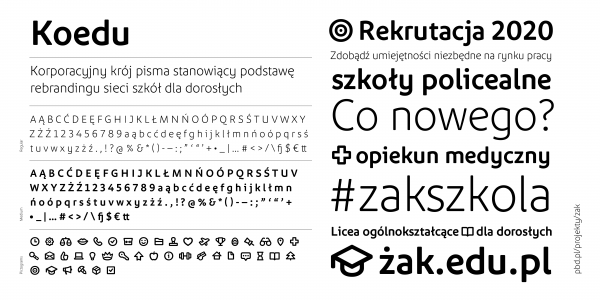
Koedu
Maciej Majchrzak
- c2017
- bWrocław
- hFonts
. . .
Słownik is my MA diploma project designed at the University of Arts in Poznań at prof. Krzysztof Kochnowicz's and assistant Viktoryia Grabowska Type Design Studio. This project explores the potential and borders of type design. Typeface design, classified as a branch of typography, seems to be a very specialist field, but on the other hand, a typeface designer has to master all of the issues concerning graphic design. As long as typefaces record speech in a fixed visual form, they are a key element of sharing meanings. Słownik (dictionary in English), a typeface family designed by a graduate of the University of Arts i Poznań, Poland, Maciej Majchrzak, as every typographic project, is designed for a specific purpose. This typeface has been designed in order to facilitate sharing knowledge described in such publications, which are read not linearly, as: dictionaries, encyclopedias, lexicons, etc. In other words, this typeface is intended for composition of long texts, where economical composition and legibility make a difference. Typography is deep-rooted in writing and calligraphy, so the principles of construction of the letters has been based on the writing with a broad-nibbed pen. The tool has been treated as the starting point of the design process. Then, the preliminary sketches have been digitized and worked out in order to make the typeface useful. The tool has always been a point of reference while making the decisions during the design process in order to maintain contact with the tradition and simultaneously seek possibilities of innovation in the field. The typeface has been designed using contemporary technology because it should serve its purpose and to meet its function, but the visual form has been based on the more timeless visual rules than the changeable technology. The principles of construction of the typeface has been based on writing with a broad-nibbed pen. The tool was both the starting point and the point of reference while making decisions during the design process. In consequence, the roman style is accompanied with a lively italic and provides contrasting textures within a coherent structure. Italic performs well as a special typeface in a longer text. The forms of the letters are simple but refined, the glyphs are clear and solid, the shapes are more organic than geometric. Having both legibility and economical composition in mind, the letters have been designed not to seem very condensed. In consequence, the refined and narrowed proportions have been achieved. The x-hight is balanced – I have been searching for the compromise between legibility and readability in small sizes and possibilities of using small leading. Słownik consists of nine weights deliberately named after the letters of the alphabet in order to give more freedom of choice to the user. The typeface supports several dozen of European languages. Diacritics have been designed with a great care and Słownik supports Latin and Cyrillic scripts. The typeface has been equipped with numerous OpenType functions. Słownik is the typeface with a modest contrast in order to meet the demands of worse printing conditions.
Styles: 4