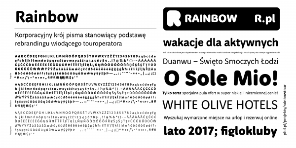
Rainbow
Maciej Majchrzak, PBD.pl
- c2015
- bWrocław
- hFonts
. . .
The typeface is solid and distinctive. The construction is simplified. The curves are short and broken – the technical character of Accens’s business activity. The stencil character and worked out details are distinctive. Stems of E, H, D or R are shaped in a way to break the homogeneity of vertical and hori-zontal elements which are characteristic for uppercase letters. The typeface was commissioned by PBD (pbd.pl) for the Accen Fall Arest company.