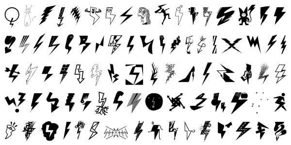
Pioruny
Honza Zamojski, Marian Misiak
- c2022
- bWrocław
- hFonts
. . .
The history of the Rubin Sans font dates back to 2014, when Honza Zamojski introduced single letters drawn with a ruler and other illustration tools into his drawings. In the beginning, they were the simplest of shapes – the letters H and A, which formed the words "HAHAHA" or "AHAHAH". Over time, the space of a sheet of paper became the field for more elaborate text and drawing compositions that could be read as short poetic forms or viewed as simple abstract images. The first attempts to draw the whole font by Honza were quite clumsy and resulted mainly from the need for a quick drawing effect. At some point, a plastic stencil was created to draw letters on paper, which over time evolved into a poor version of a digitised font. The distinctive Rubin Sans icons and letters then appeared in many forms (on murals, sculptures, books and even mugs), taking up an important position in the practice of the author and artist. The evolution of the font ran parallel to the development of Honza's work, and individual characters of the alphabet and icons emerged as they were needed. By consistently incorporating letters into artistic practice, the font has become one of the distinctive features of the visual ecosystem of Honza Zamojski's works. In 2022, in collaboration with the Threedotstype type foundry and with the design support of Nika Langosz, a more complete version of the Rubin Sans font was created – in four weights and with more than 200 icons. This marked the beginning of a new phase in the life of these specific letters – from the privacy of an art studio to a presence in the public world of typography.
Styles: 4