. . .
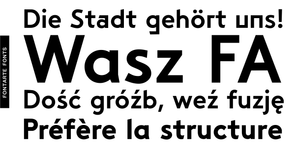
Saturator FA is inspired by vernacular typography and refers to hand made lettering and signs from Polish communist republic (PRL) period. Its informal and friendly character allows for different creative ways of usage. It is recommended for publishing, advertising and branding to get fresh handmade feeling. The first version of Saturator FA Regular was designed by Magdalena Frankowska in 2007 and used successfully by many graphic designers all over the world. New version of Saturator FA is broadened with more diacritic characters for most of Latin languages. In 2016 new styles: Italic, Serif Regular and Serif Italic were designed to enrich the Saturator FA family.
Styles: 2