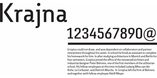
Krajna
Franciszek Otto
- c2012
- bNakło nad Notecią
- hFonts
. . .
The typeface references the style of the Bodoni's cursive with high, characteristic stroke contrast. The uppercase is enriched with decorative lines similar to handwritten calligraphy. High contrast and steep angle lower the legibility, which is why it is best used above 14 pt. The typeface is used for personal projects by the author.