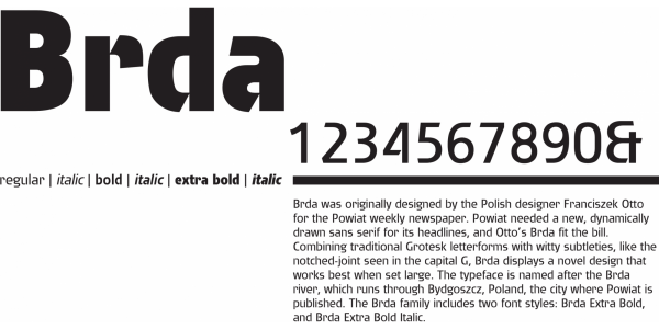
. . .
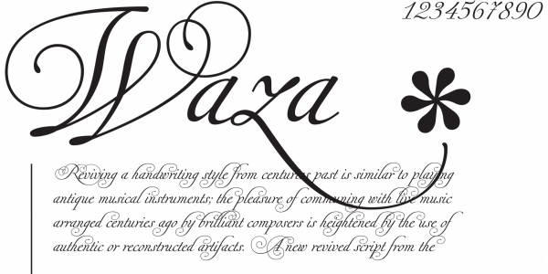
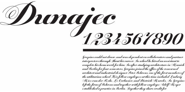
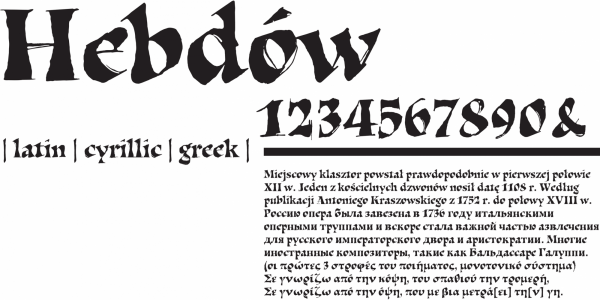
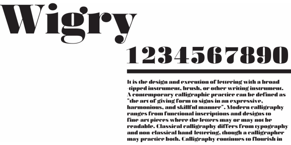
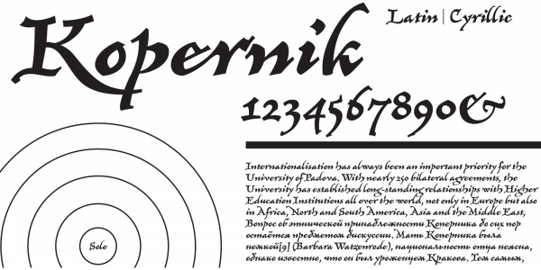
Flexible nib, tool-based design. The high contrast is the result of the used nib, which leaves a thick line underr pressure, on the down stroke, and a thin one on the up strokes. Apart from that the serifs are connecting which emphasises the baseline. The letters reference the classic design by Bodoni. The font contains Latin, Greek, and Cyryllic scripts.