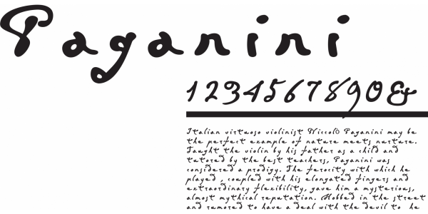
Paganini
Franciszek Otto
- c2004
- bNakło nad Notecią
- hFonts
. . .
Design inspired by the handwriting of st. John Paul II. The font is defined by a rough structure of the letters, slighly bouncing of the baseline, immitating typical written text. Their short x-height, long ascenders and descenders, and exceptional uppercase bare a striking resemblance to handwriting. The JP2 typeface is highly dinamic due to a steep letter angle, without loosing its legibility.