. . .
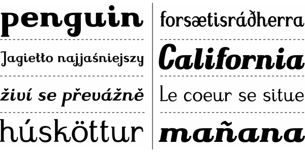
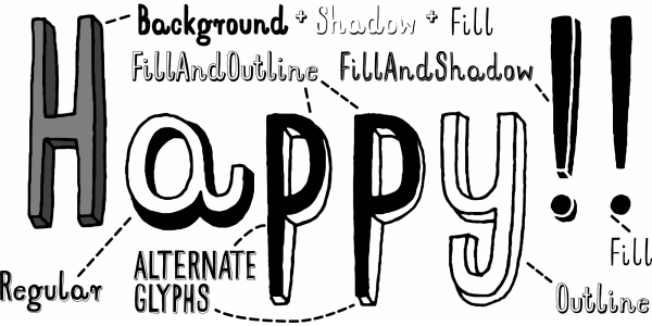
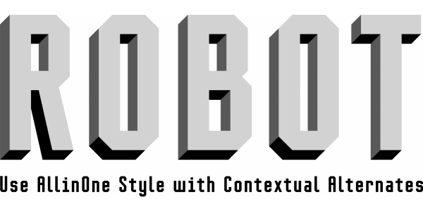
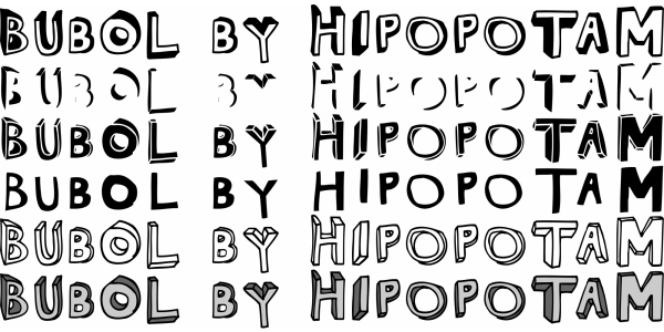
Mr Dodo was designed in 2013 and it’s a hand-drawn typeface family with eight styles: four weights, each having a rounded version. It has uppercase and lowercase characters with up to three alternate glyphs. Each style was drawn separately. We did not interpolate any glyphs to keep an irregular, organic feeling. This way you can combine different styles without worrying that same characters will look like an awkward copy when standing close to each other. It has built-in OpenType Contextual Alternates feature that will automatically set alternate glyphs depending on frequency of appearance of the same character (even in web font, but only in HTML5 browsers). The script doesn’t just throw random glyphs. This is by far the most frequently used typeface in all of our books. Since we finished working on it, it’s our go-to font whenever we don’t know what to use. The variety of styles and not-overaggressive shape distortion make it a perfect sidekick for our way of making books. You can buy it on MyFonts.