. . .
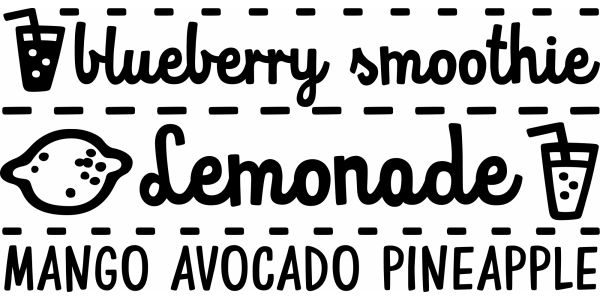
We designed Mrs White for our book, “Mapy”. We needed a clean script that would look good in small sizes, had connecting letters, would look good when written on a curve, and had a feel of primary school handwriting. Mrs White is filled with ligatures and contextual alternates which gives her very smooth line of text. Scripts shouldn't be used without lowercase letters, so we added small caps for headlines and acronyms. Check out the manual for more information on how to use Mrs White. We knew that “Mapy” would probably be published in Cyrillic-based languages, so aside of designing Latin characters, we designed Cyrillic alphabet (including all special Open Type features). You can buy it on MyFonts.