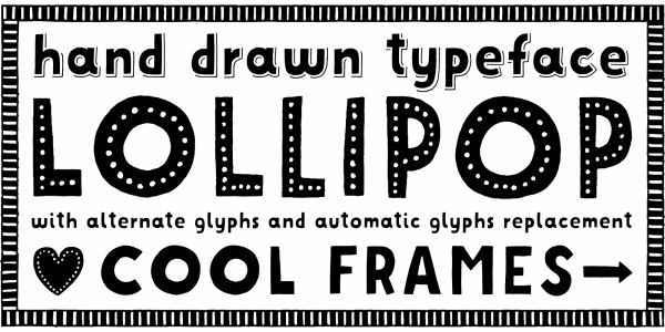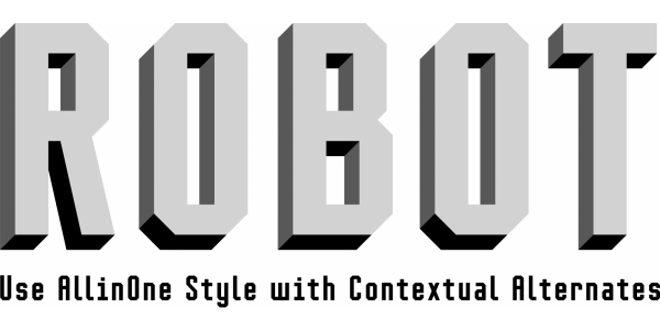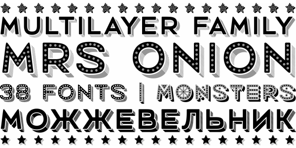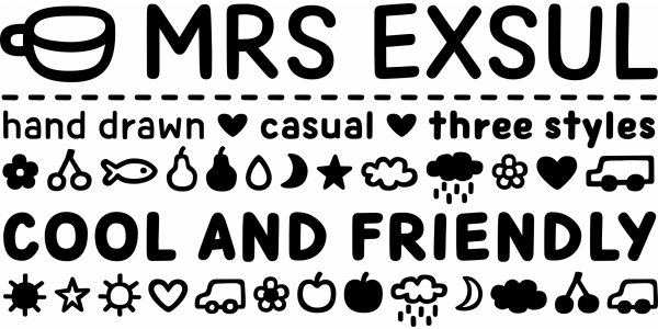
. . .
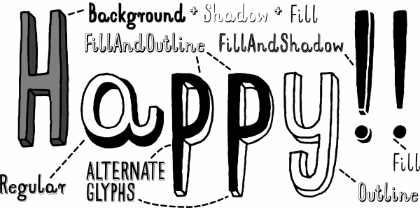
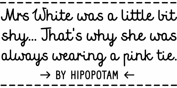
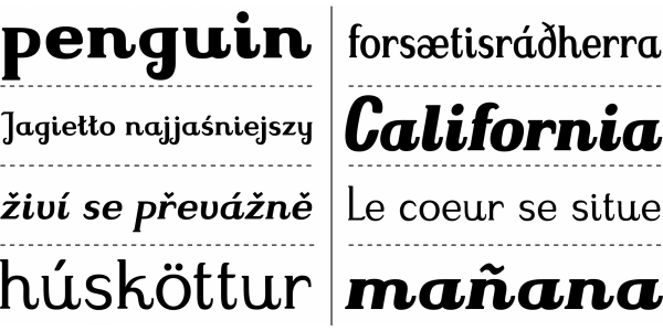
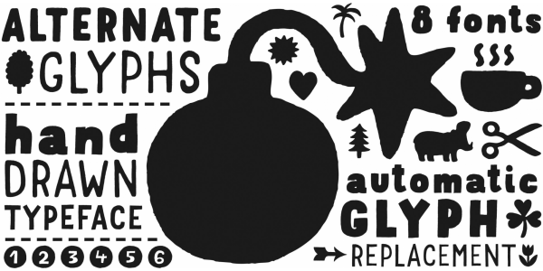
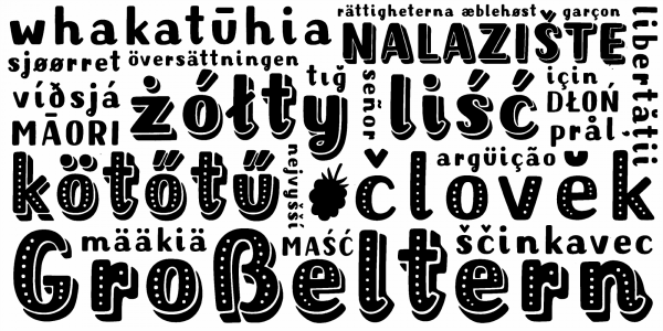
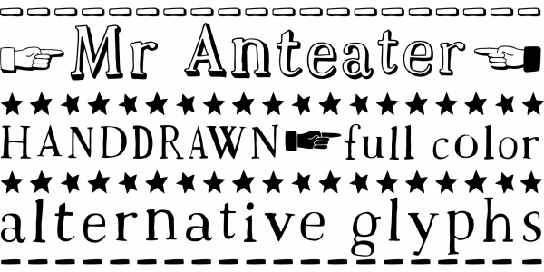
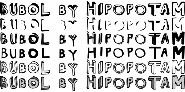
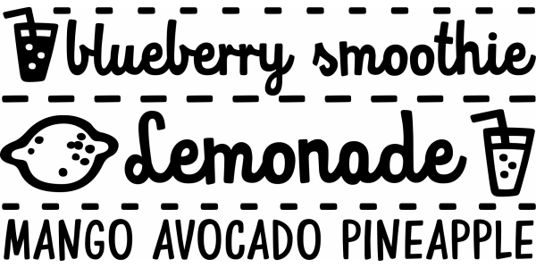
Mr Orange was designed in 2012 and it’s a typeface based on our hand-written letters from “H.O.U.S.E” and “Who Eats Whom”. After the first publication, where all side notes were just scanned images of our hand-written letters, we were faced with a choice to write everything again and again for every foreign edition, or to create a font. The font has up to three alternate glyphs for each character, even for every diacritic letter. We use our fonts in our books on regular basis, so we know that switching alternate glyphs can be a pain in the ass. That’s why we created a very cool Contextual Alternates feature. It automatically sets alternate glyphs, depending on frequency of appearance of the same character. The script doesn’t throw random glyphs. It checks if, let’s say, letter “A” appears more then once in a sequence of characters. For example, in the word “ANAKONDA”, the third “A” and the second “N” would be switched with glyphs from first stylistic set, the second “A” would also be changed but to glyph from second stylistic set. We designed different rules for basic characters and different for diacritics and punctuation. It really works great, but of course, you can always fine-tune it by hand. This option has one obvious advantage for web fonts. Browsers that support OpenType calt feature will be able to display alternate characters. Since you can’t put alternate glyphs by hand on your website this is the only way to use them. You can buy it on MyFonts.