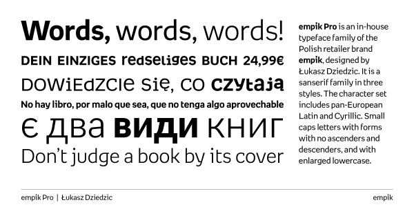
EMPIK PRO
Łukasz Dziedzic
- c2007
- bWarszawa
- hFonts
. . .
In FF Mach, all curved lines have been replaced by straight ones, some of which are set at angles. This results in a rather technical appearance, and one that’s contemporary in feeling. The family has 18 styles in all: six weights in three widths. FF Mach’s first sketches were drawn in 2004, when a colleague of Dziedzic’s planned a new Polish arts and culture magazine. He asked Dziedzic for a logo; there was neither time nor money, and Dziedzic produced one for free. The logo got approval, and Dziedzic was asked to provide a few sample covers. A few days later, his colleague requested a full layout. Again, for free. Dziedzic pursued the project with mixed feelings, hoping he might find a way to put some of his typefaces to use, and even make a new one based on the logo and title graphics. The result was the heart of the FF Mach family. It worked rather well – unfortunately, however, the magazine failed three months later. The typeface fell into disuse until Dziedzic dusted off the project and redrew all the glyphs in 2008, removing the traces of its hasty origin.
Styles: 15