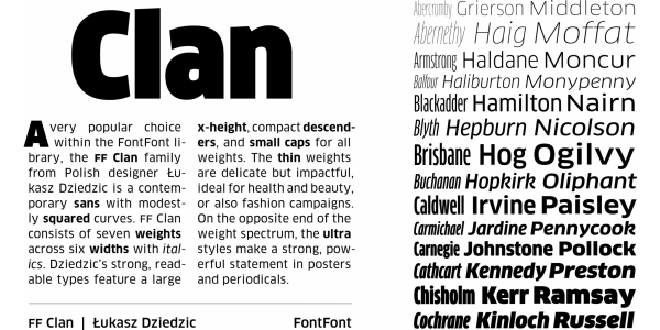
FF Clan
Łukasz Dziedzic
- c2007
- bWarszawa
- hFonts
. . .
Lato is a sleek sanserif typeface family designed in the Summer 2010 and extended in the Summer 2013 by Warsaw-based designer Łukasz Dziedzic (“Lato” means “Summer” in Polish). Lato tries to carefully balance some potentially conflicting priorities: it should seem quite “transparent” when used in body text but would display some original traits when used in larger sizes. The classical proportions, particularly visible in the uppercase, give the letterforms familiar harmony and elegance. The semi-rounded details of the letters give Lato a feeling of warmth, while the strong structure provides stability and seriousness. In 2013–2014, the family was greatly extended (with the help of Adam Twardoch and Botio Nikoltchev) to cover 3000+ glyphs over nine weights with italics. It now supports 100+ Latin-based languages, 50+ Cyrillic-based languages as well as Greek and IPA phonetics. According to Google Fonts, Lato is used on over 11 million websites, and is the most popular independently-made font in the world. The Lato font family is available free of charge under the SIL Open Font License.
Styles: 18