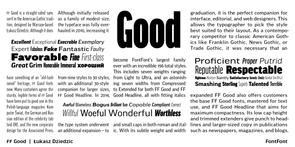
. . .
These days, it’s easy to find typefaces with multiple widths and weights, but they’re nearly all sans serifs. Large serif families are much less common. The 30-style FF More fills this need. In three widths, five weights each, the family answers every need of publication design, from readable text and space-efficient captions to strong headlines. FF More’s robust serifs and gentle contrast hold up to the rigors of magazine and newspaper work. The typeface retains legibility despite size or substrate. Łukasz Dziedzic built FF More with his versatile FF Good typeface in mind the two making a powerhouse superfamily, capable of range in both its function and aesthetic. Like FF Good, FF More supports Cyrillic-based languages across all its styles. This increases the editorial potential of the face significantly. FF More was selected by Communication Arts magazine for feature in its prestigious Typography Annual in 2012.
Styles: 60