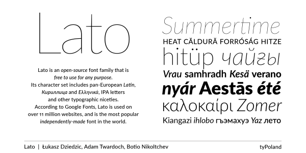
Lato
Łukasz Dziedzic, Botio Nikoltchev, Adam Twardoch
- c2010
- bWarszawa
- hFonts
. . .
In his primary role as an editorial and magazine designer, Łukasz Dziedzic has been in a constant search for new typefaces. Most of his own type designs originate from situations where he felt none of the available faces worked “quite right” in the context of a project he was working on. Therefore most of his typefaces have at some point seen use in real magazine layouts, and have been refined based on those findings. This was also the case with FF Pitu: an early version of the design was used in the Polish weekly “Europa” until the magazine took a different stylistic direction. FF Pitu started off in 2002 as a set of swashy capitals accompanied by a lowercase that sits somewhere between a Didot italic and a copperplate script. Its most characteristic features are its pronounced stroke modulation and sharp, blade-shaped stroke endings, which are slightly softened by generous loops with “foxtail” terminals. While keeping an inclined angle, Łukasz expanded the initial face into a three-weight family, changed the proportions of the lowercase, reworked the swash caps and added a complete set of “simple” Didone capitals and small caps. In 2004, FF Pitu was selected for the “Bookmark” exhibition that showcased Central European type designs. The exhibition took place in The Hague, hosted by the Slovak Centre of Design. Later in 2009, FF Pitu received a Certificate of Excellence at the ISTD Awards.
Styles: 6