. . .
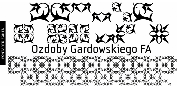
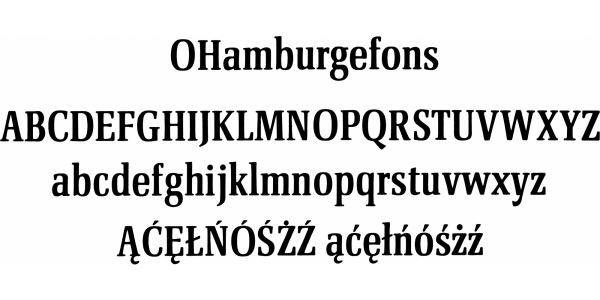
Silesiana typeface was designed by Artur Frankowski and Henryk Sakwerda at the request of the Marshal's Office of the Silesian Voivodeship and the Silesian Castle of Art and Enterprise in Cieszyn. The designers started working on the Silesian typeface in April and finished in October 2006. According to the brief Silesiana was to be an elegant, decorative font for special prints, such as congratulatory letters, diplomas, invitations, etc., promoting the Silesia Region by using its regional typographic traditions. The project was preceded by studies of prints and manuscripts in the Silesian Library in Katowice and in Książnica Cieszyńska. This typeface refers to the literary activity of Hieronim Wietor - an excellent Silesian publisher and typographer, creator of the original italic style from the 16th century and the so-called Kurrenta, a handwritten letter with Gothic roots, commonly used in Silesia in the 17th-19th centuries. The forms of Silesiana characters are based on the oblique lettering - cancellaresca - chancellery Latin cursive writing, however, they have their own original shape. The proportions of x-height, ascenders, descenders, and capitals were derived from the golden ratio rules.